The Anatomy of a Kitchen Renovation: Five Decisions That Changed This Woburn Home
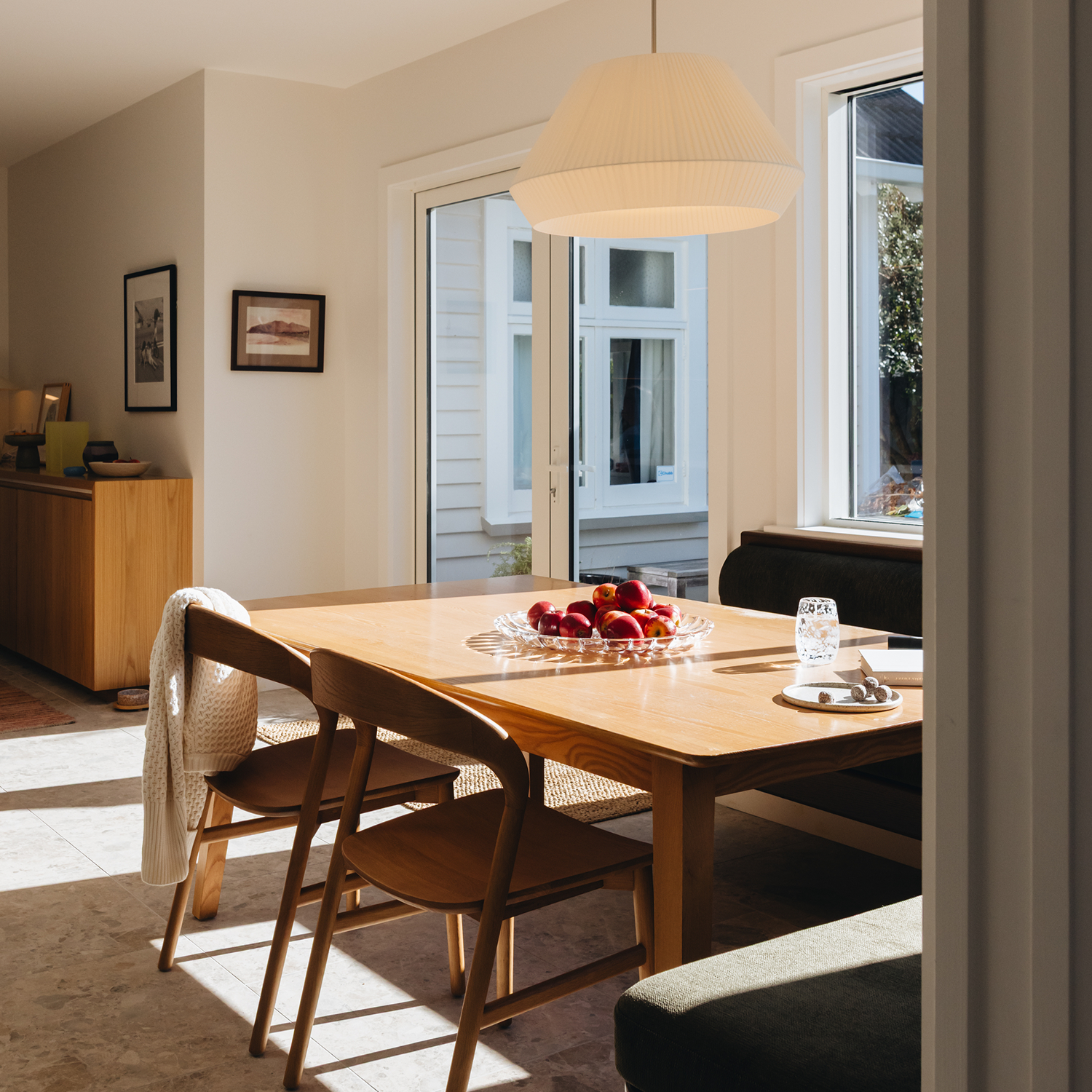
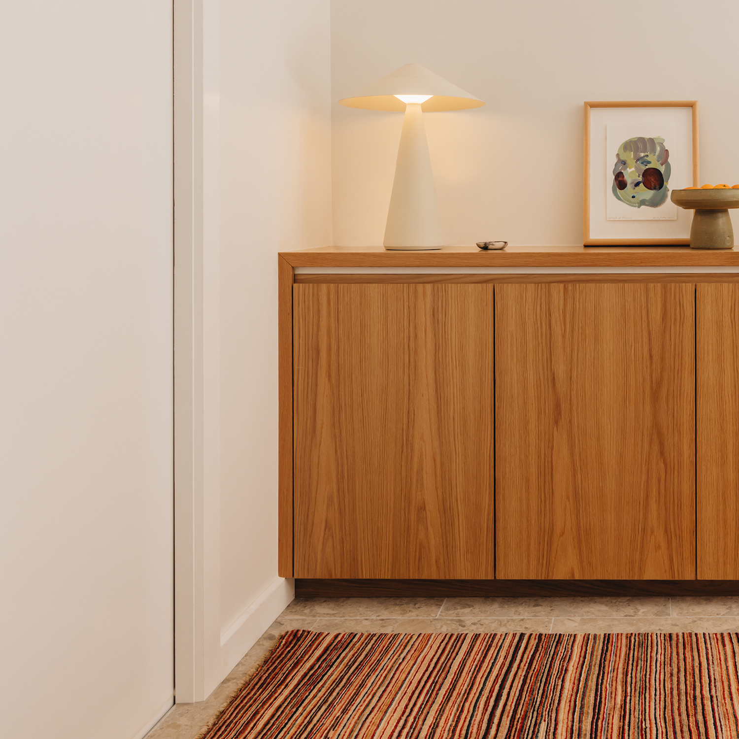
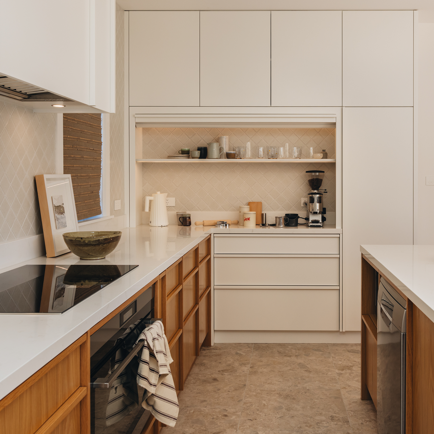
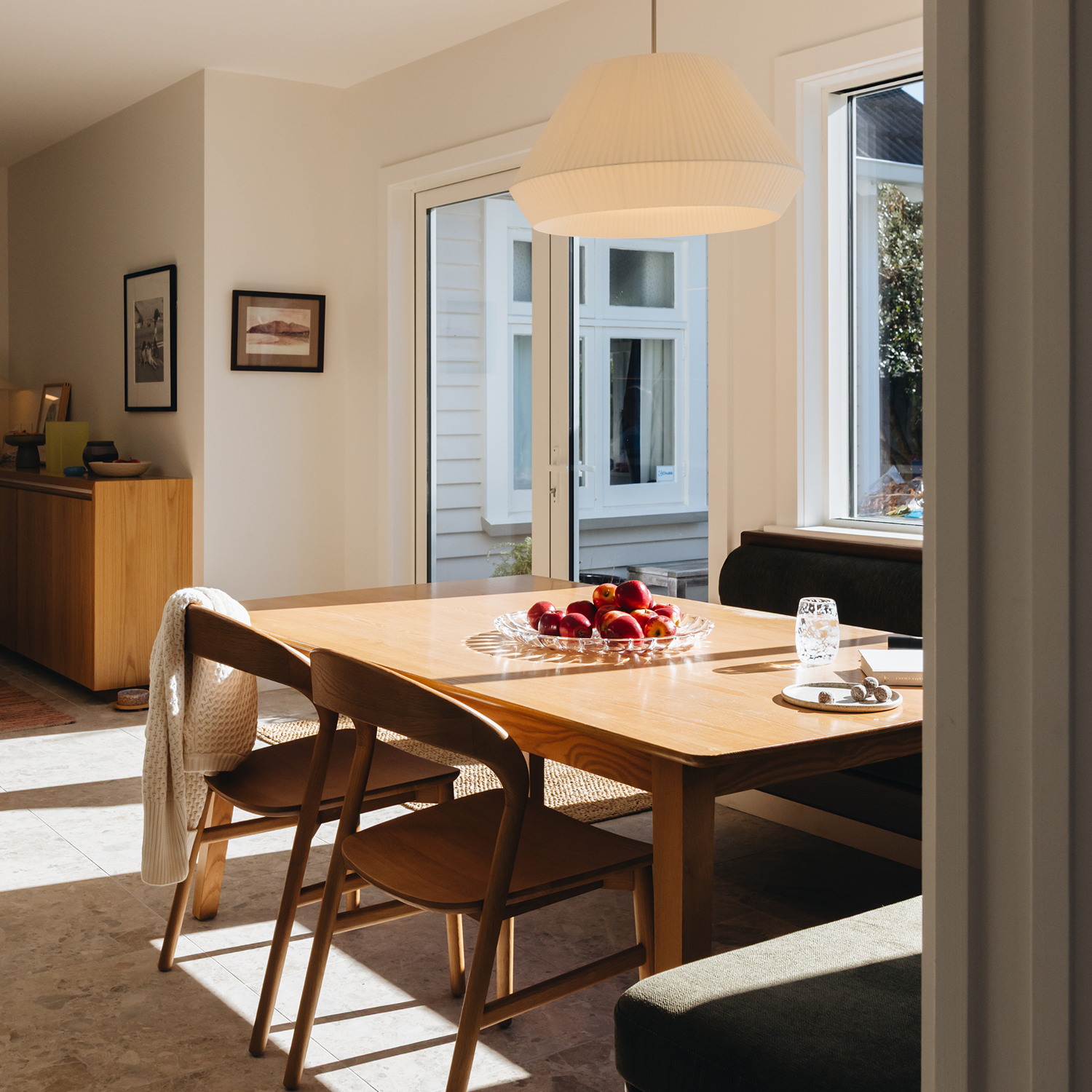
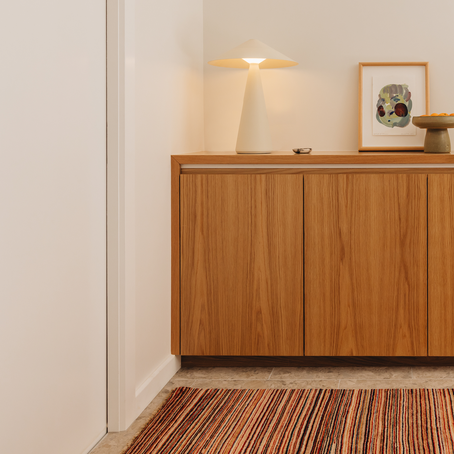
Kate and Adam's kitchen, in a traditional weatherboard family home in Woburn, Lower Hutt, already had five windows, a skylight and a garden to look out onto. Somehow, it still felt dark, and the best corner of the room held a single armchair.
We added no extra floor area to the house. Instead, by rethinking how the existing space worked, we were able to bring in more natural light, create a dining area the family genuinely wants to spend time in, put everyday storage within easy reach, and make the kitchen and dining room work as one connected space.
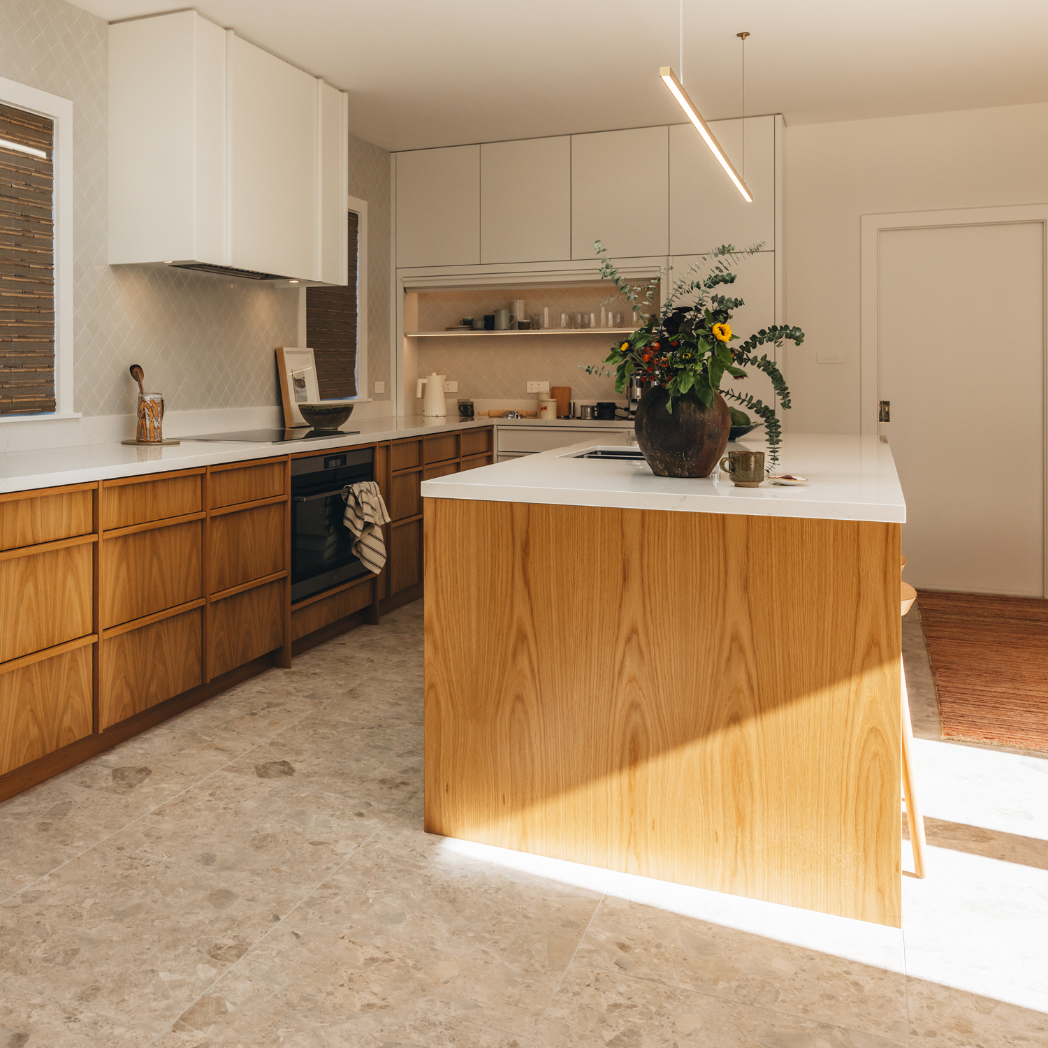
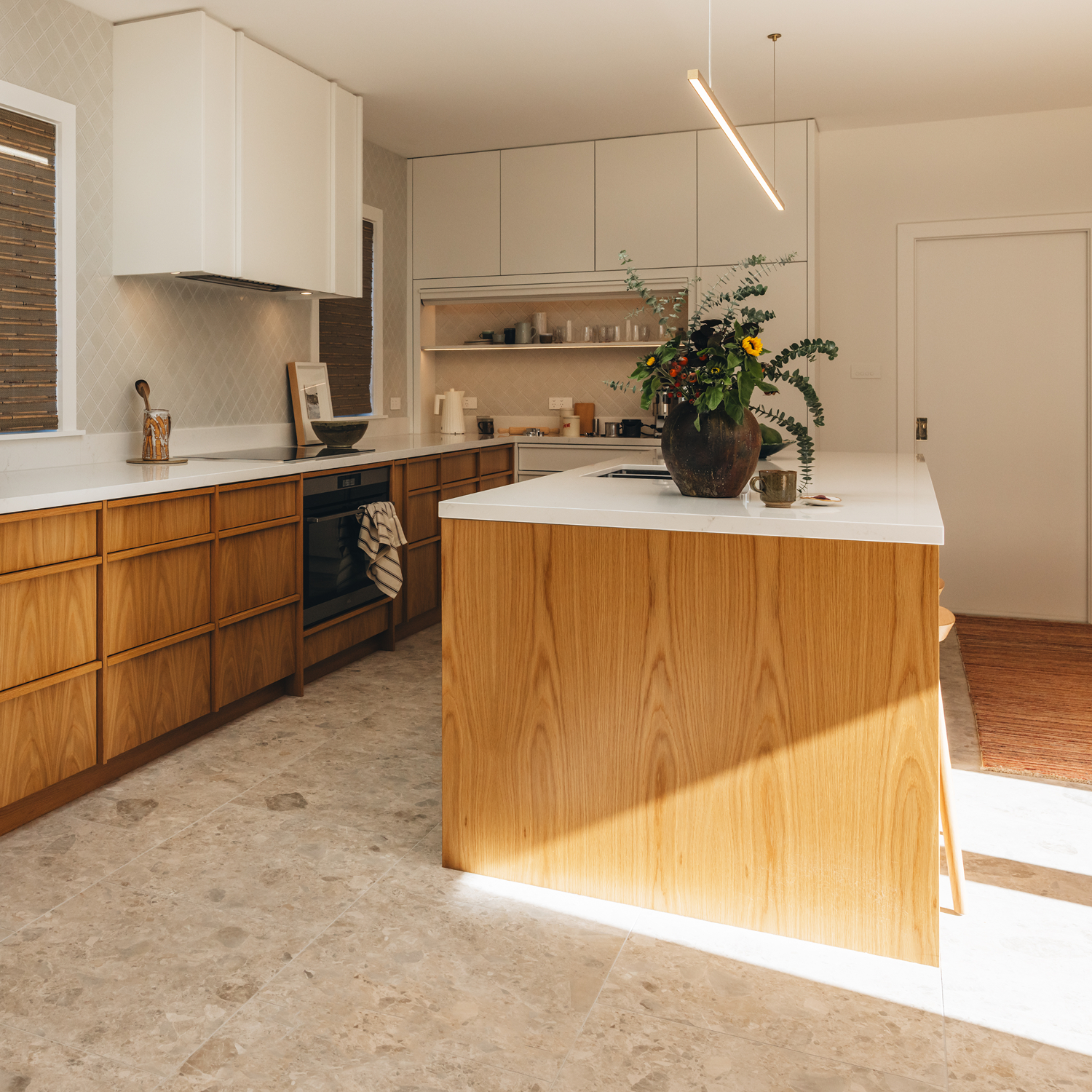
The result is a warm, bright, hard-working kitchen and dining room that belongs to both the house and the way this family lives in it.
None of it happened by chance though. It came from a series of considered decisions, including one Kate and Adam had not seen coming, which produced a comment we love to hear: "I would never have thought of that."
Here are the five decisions we believe made the biggest difference, and the thinking you can borrow for your own kitchen renovation:
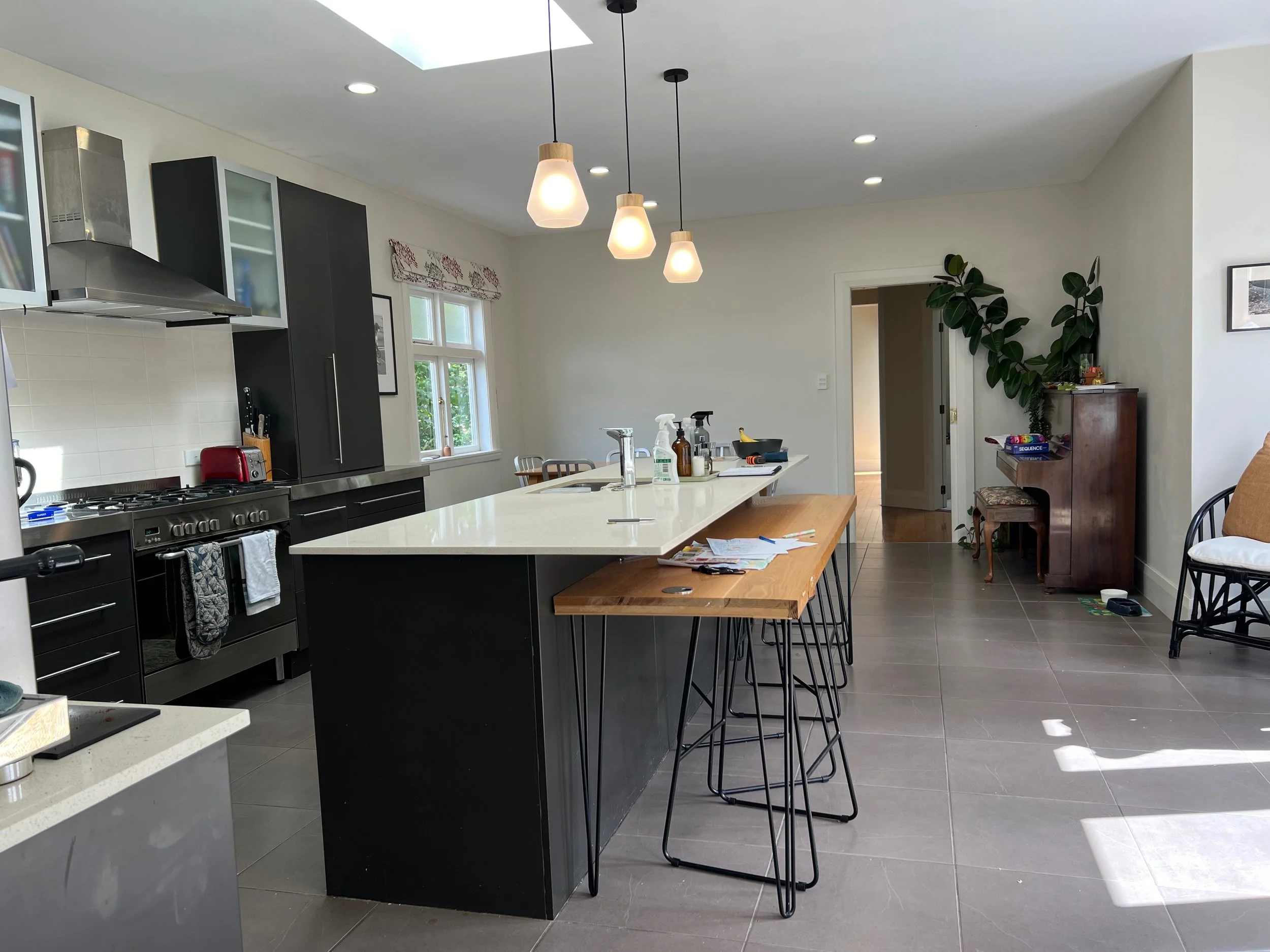
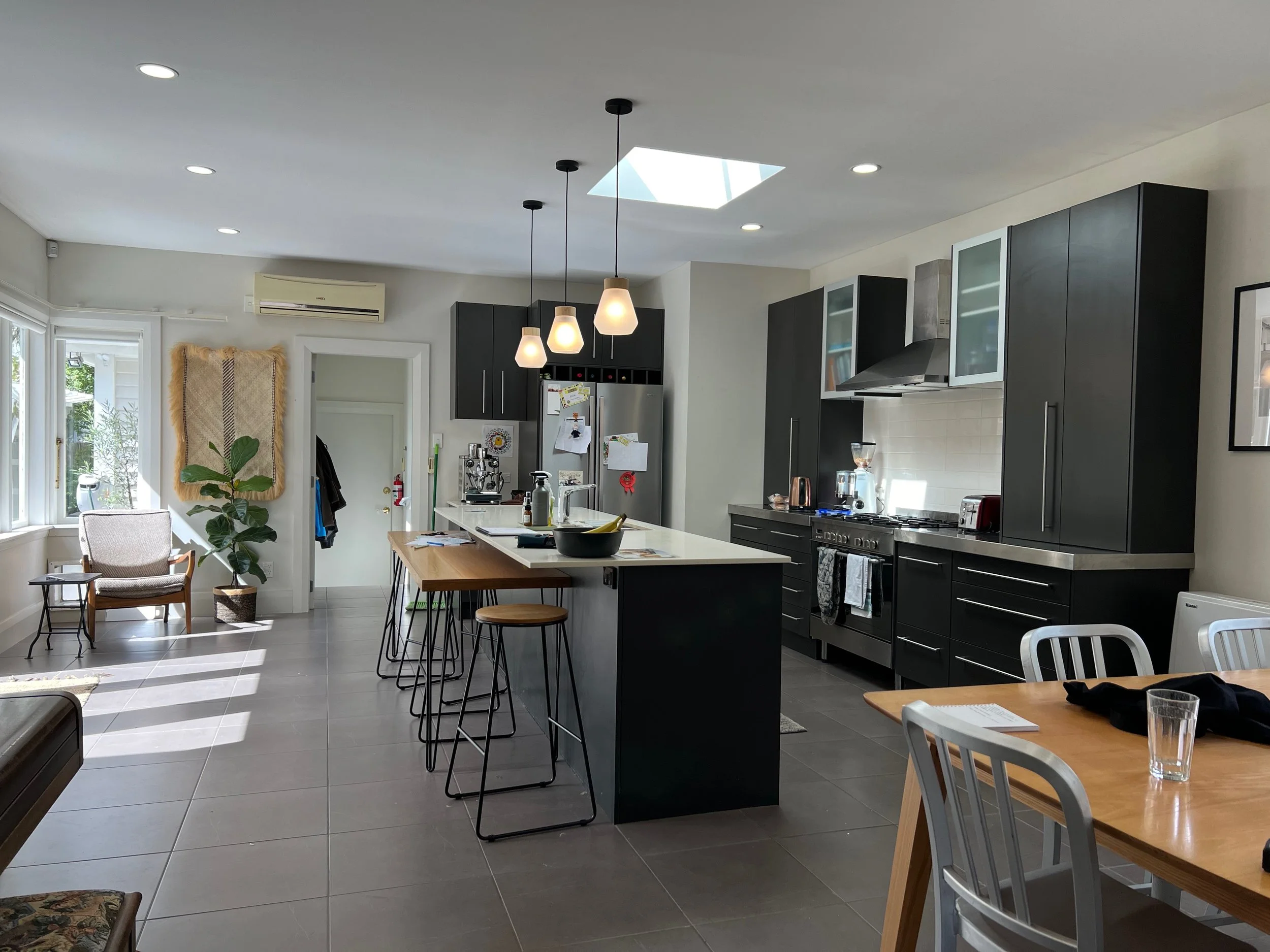
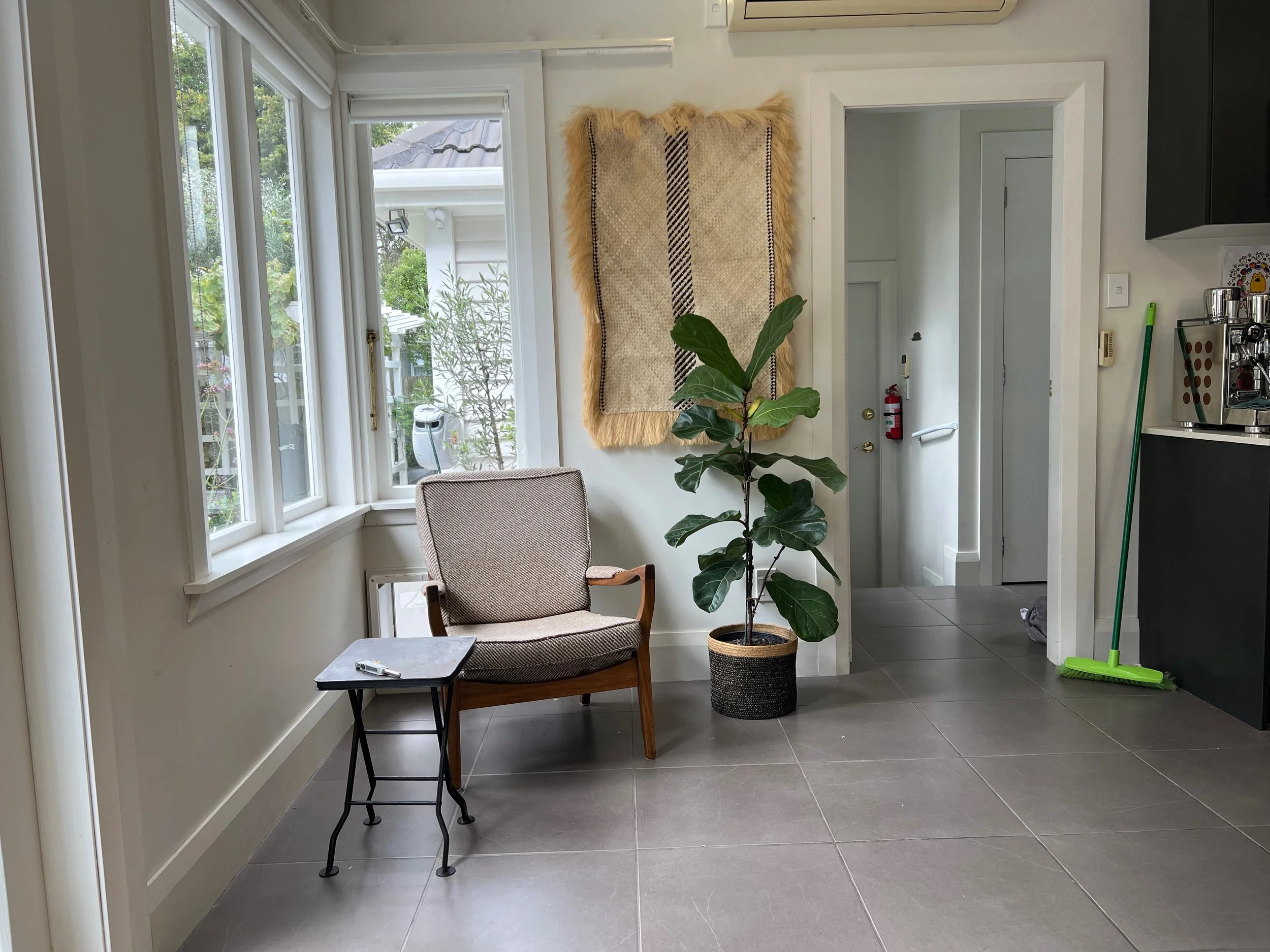
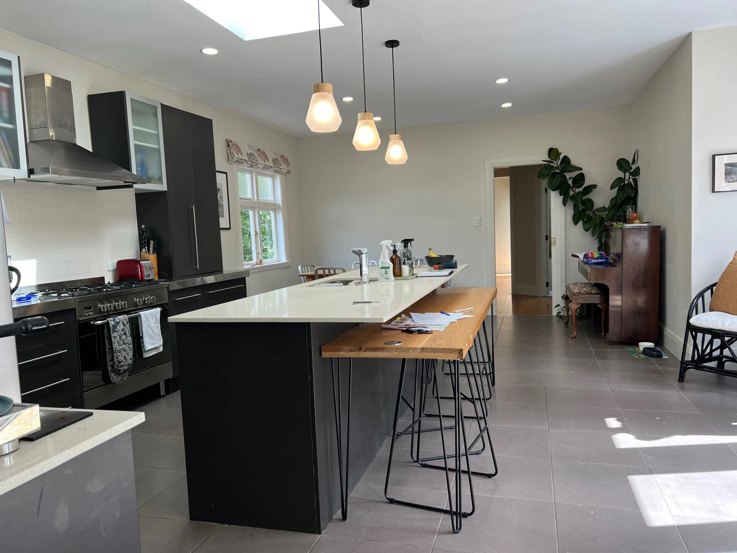
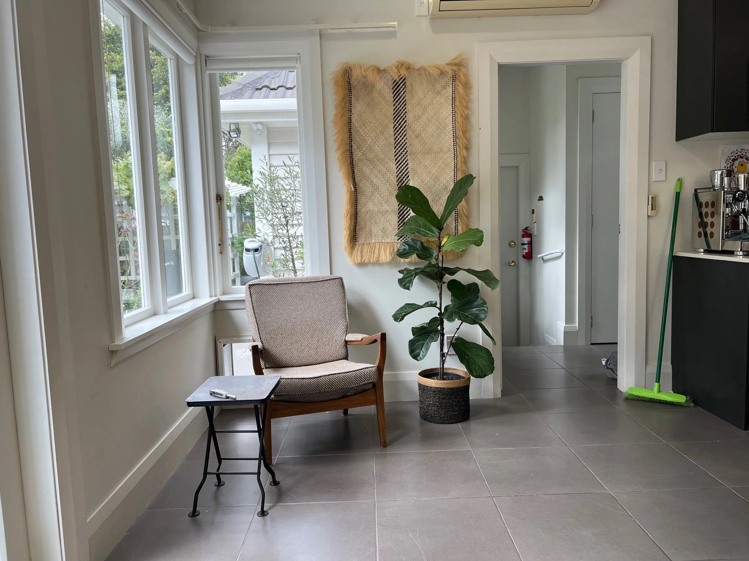
Above: The kitchen and dining room before the renovation.
1. The light was already there. They just were not close enough to it.
The old kitchen ran along the back wall, with the dining table pushed into a darker corner. The cabinetry was black, but for us, the darkness was not simply a colour problem. It was a distance problem.
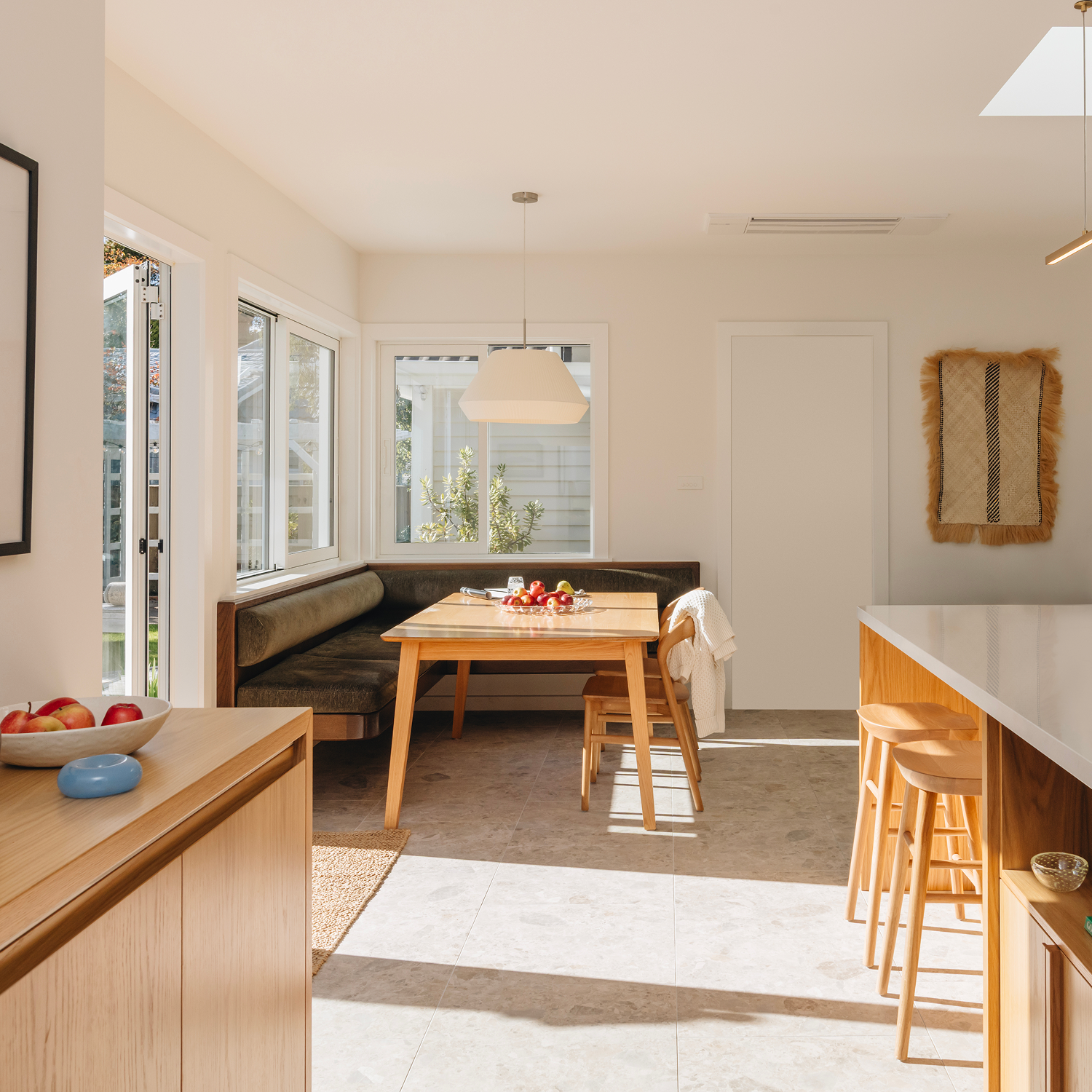
Natural light does not always travel through a room in the way you expect. Sometimes you need more of it than you think, other times, you simply need to be closer to it. So we added two extra windows to give the kitchen its own source of natural light and moved the family dining area towards the existing garden windows.
Tip: Before assuming you need more windows, look at where you actually spend time in relation to the ones you already have.
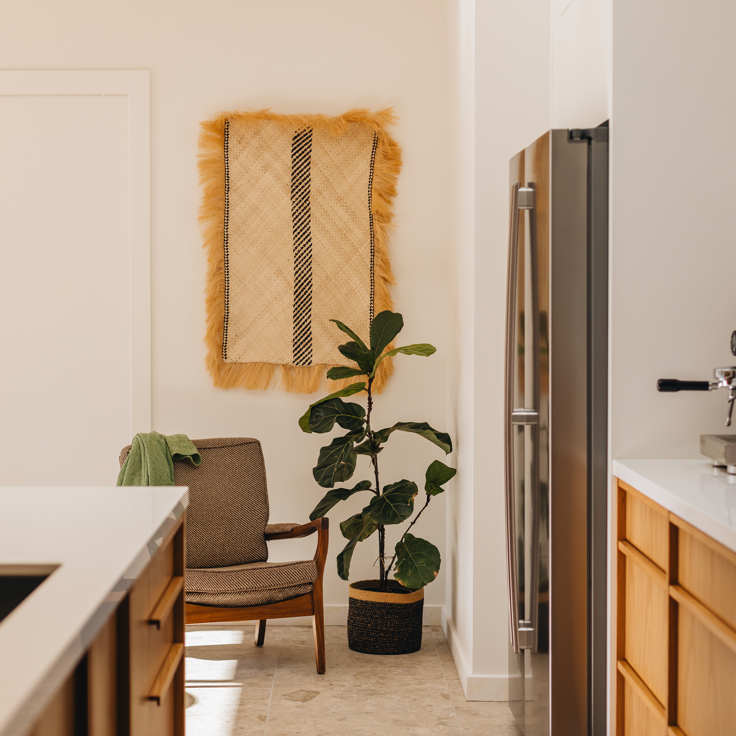
2. The best corner of the room held a single armchair
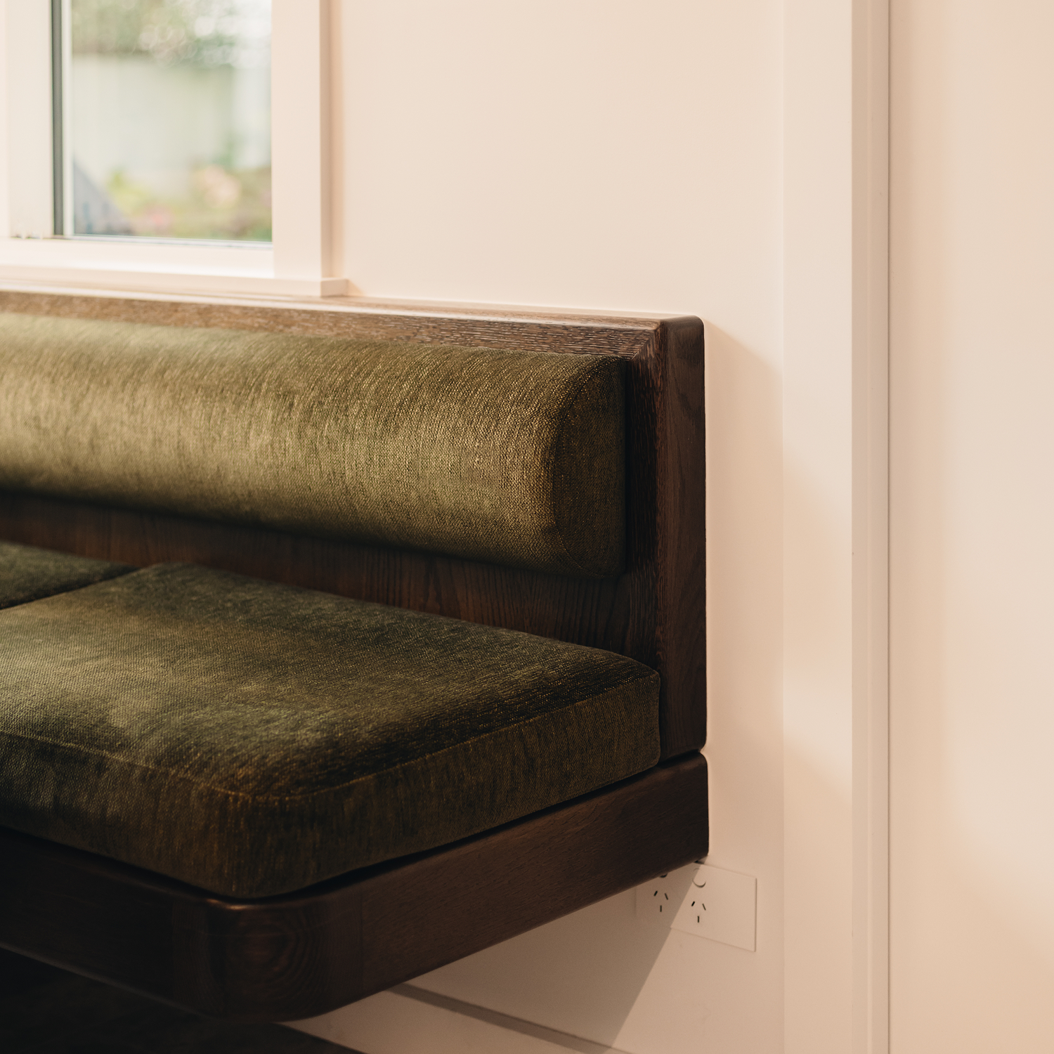
Every room has its best spot. Here, it was the corner where the windows meet overlooking the garden, and it held one armchair. The dining table, where the family gathers every day, sat further back in the room.
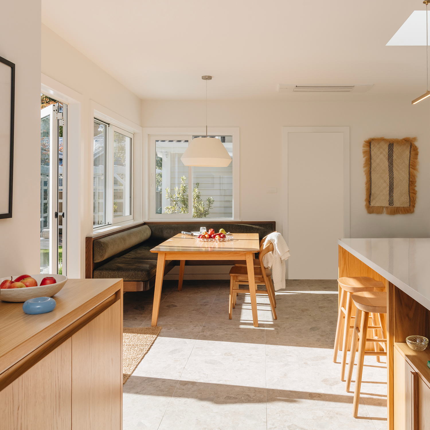
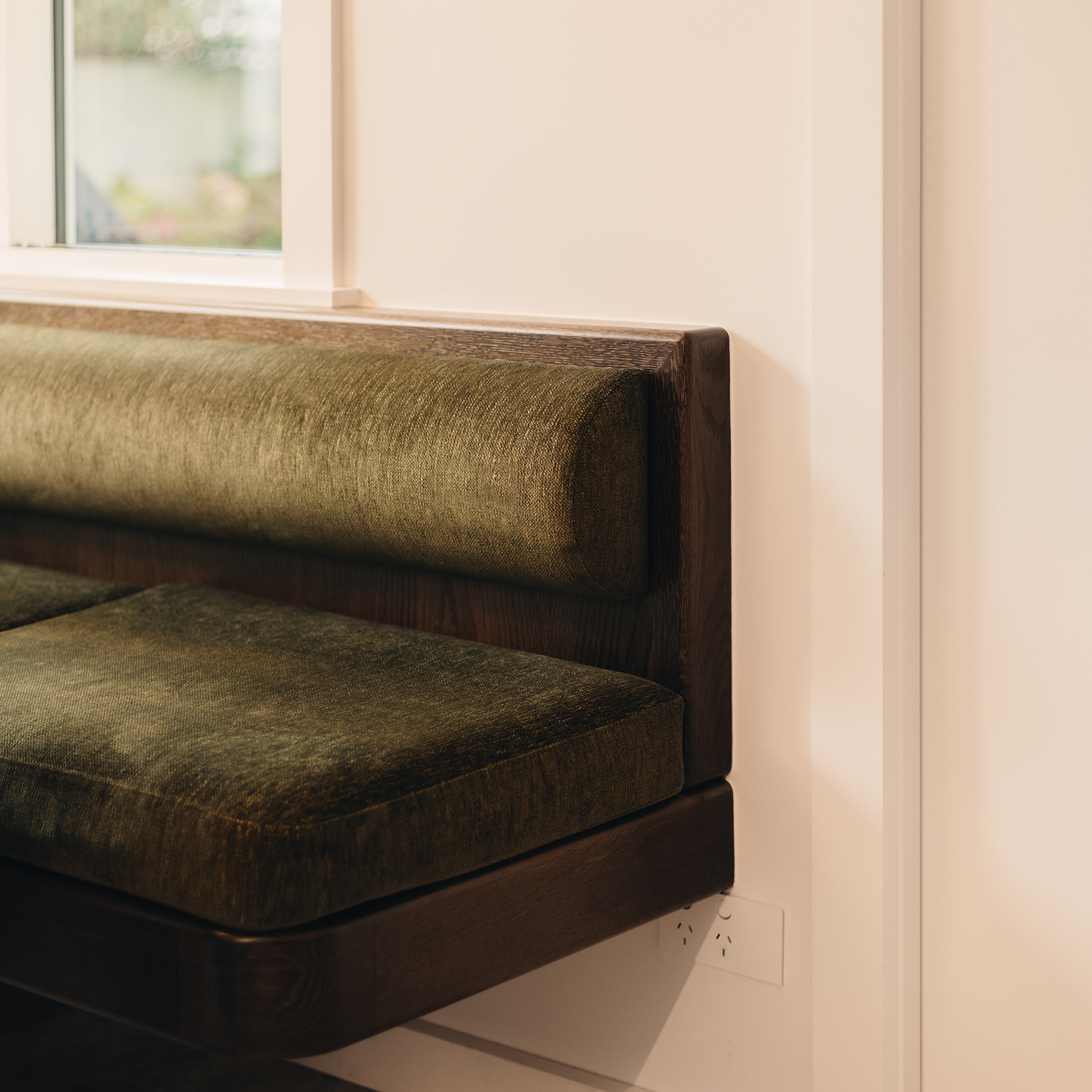
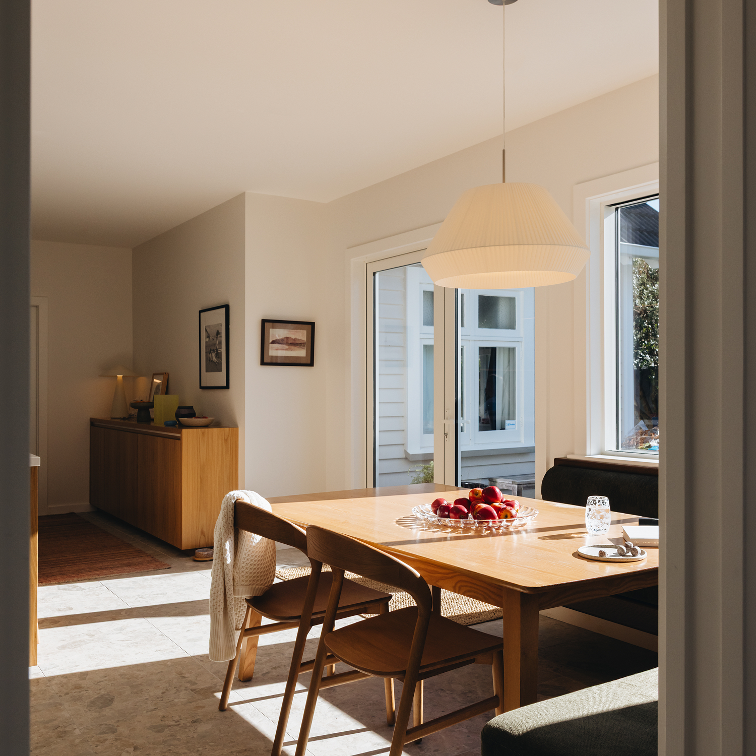
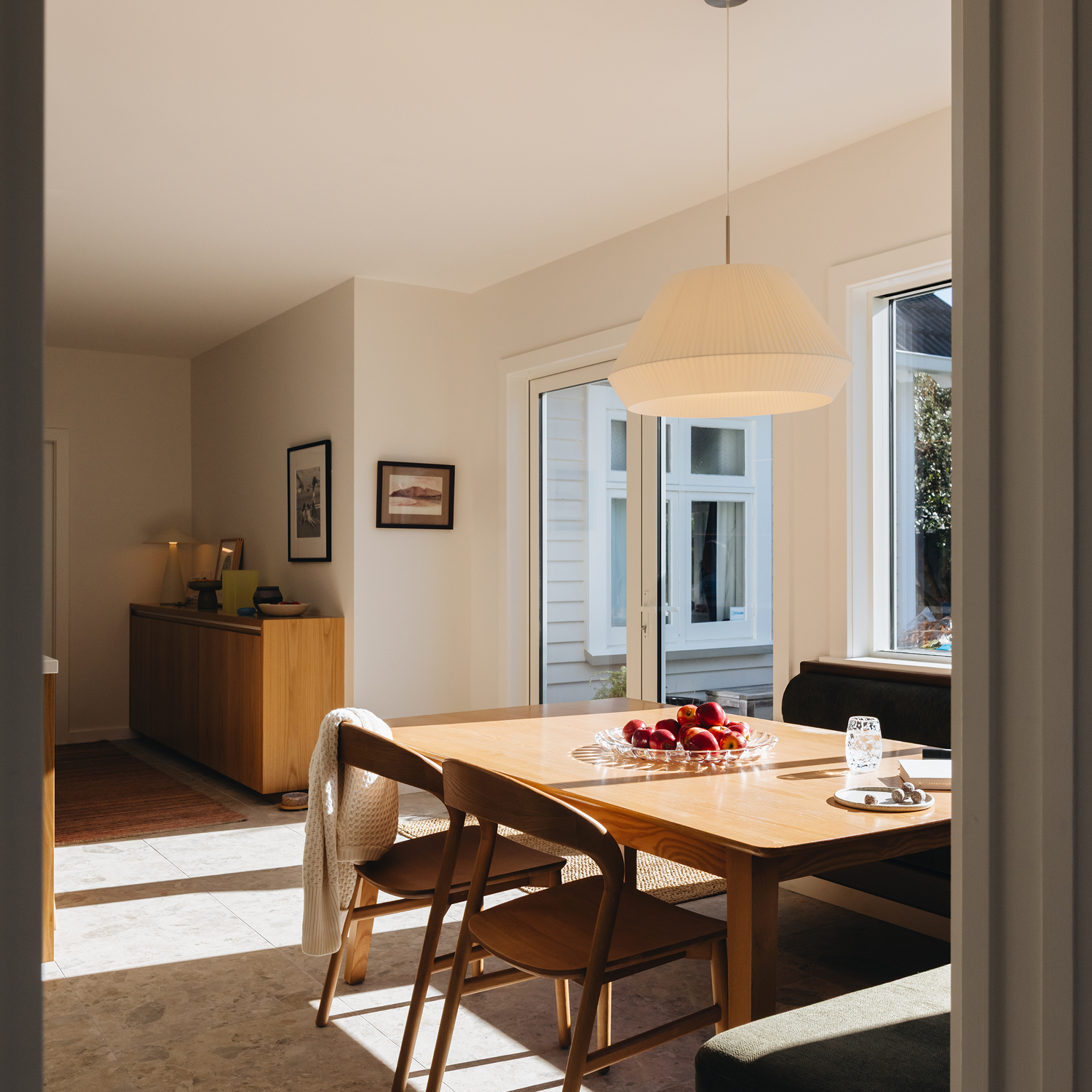
So we swapped them. The dining area moved into the light, with a bench seat wrapping the corner, while the kitchen took advantage of the long back wall.
We often say that people are drawn to windows like moths to a flame. It is a simple observation, but an important one: good spatial planning should work with the way people naturally behave, rather than against it.
Tip: What is the best spot in your kitchen? What is in it now? Has it earned that spot?
3. A pantry ten steps away might as well be in a different country
Kate and Adam had a perfectly sensible idea: turn the adjoining laundry into a walk-in pantry, and on paper, it worked, but how about in everyday use?
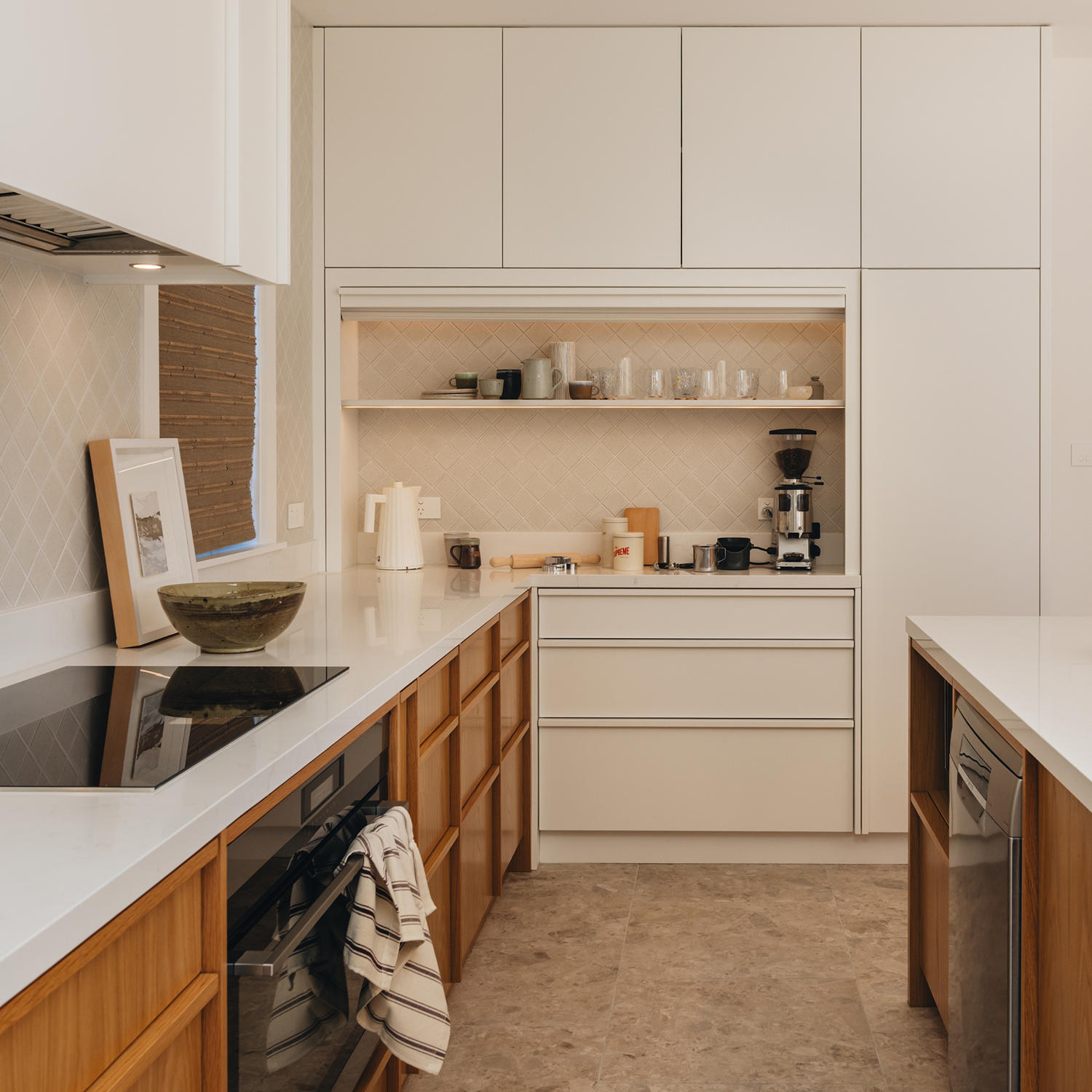
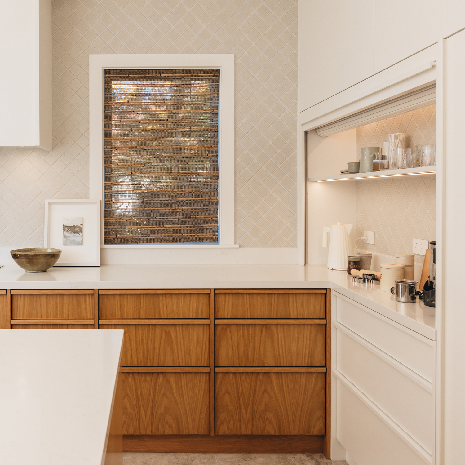
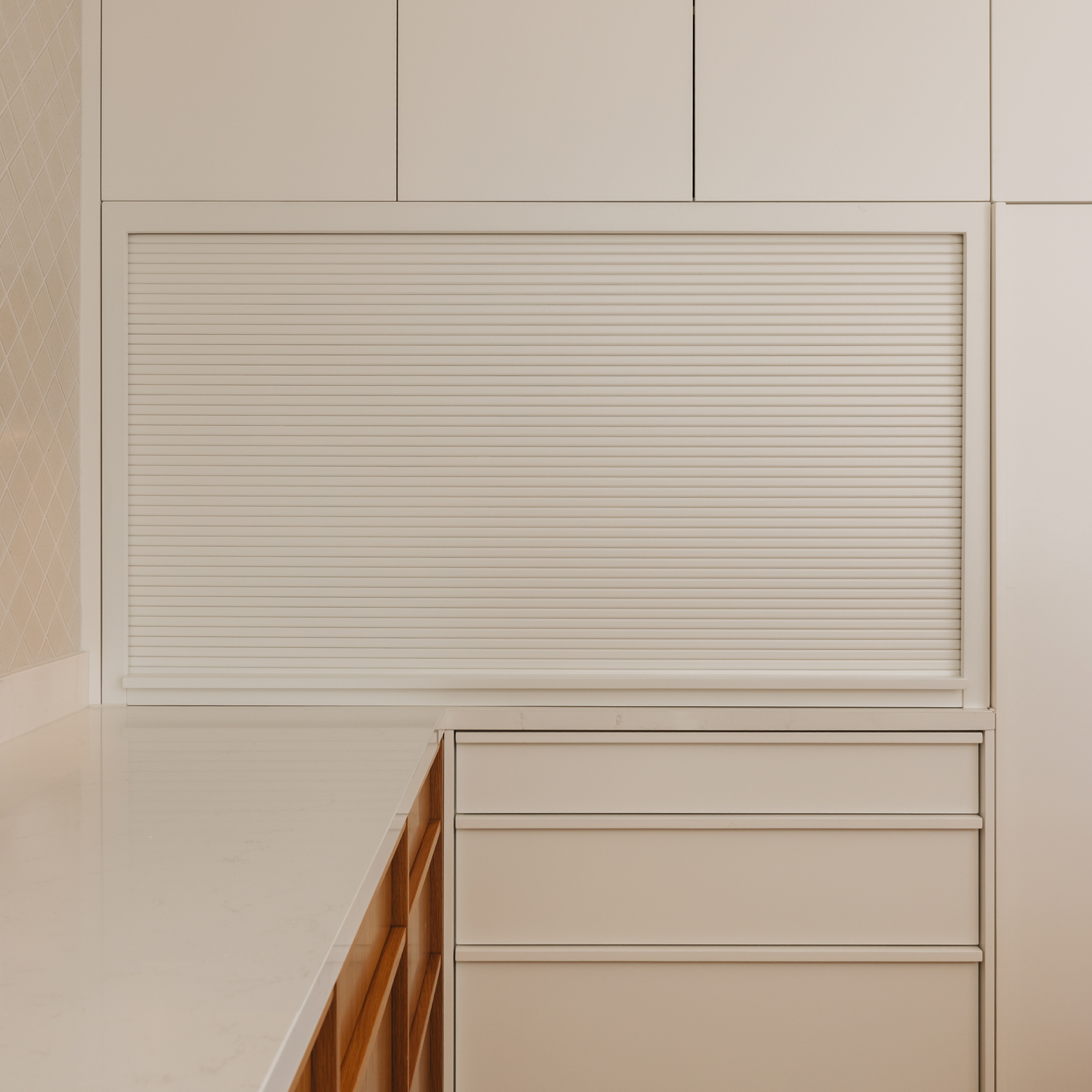
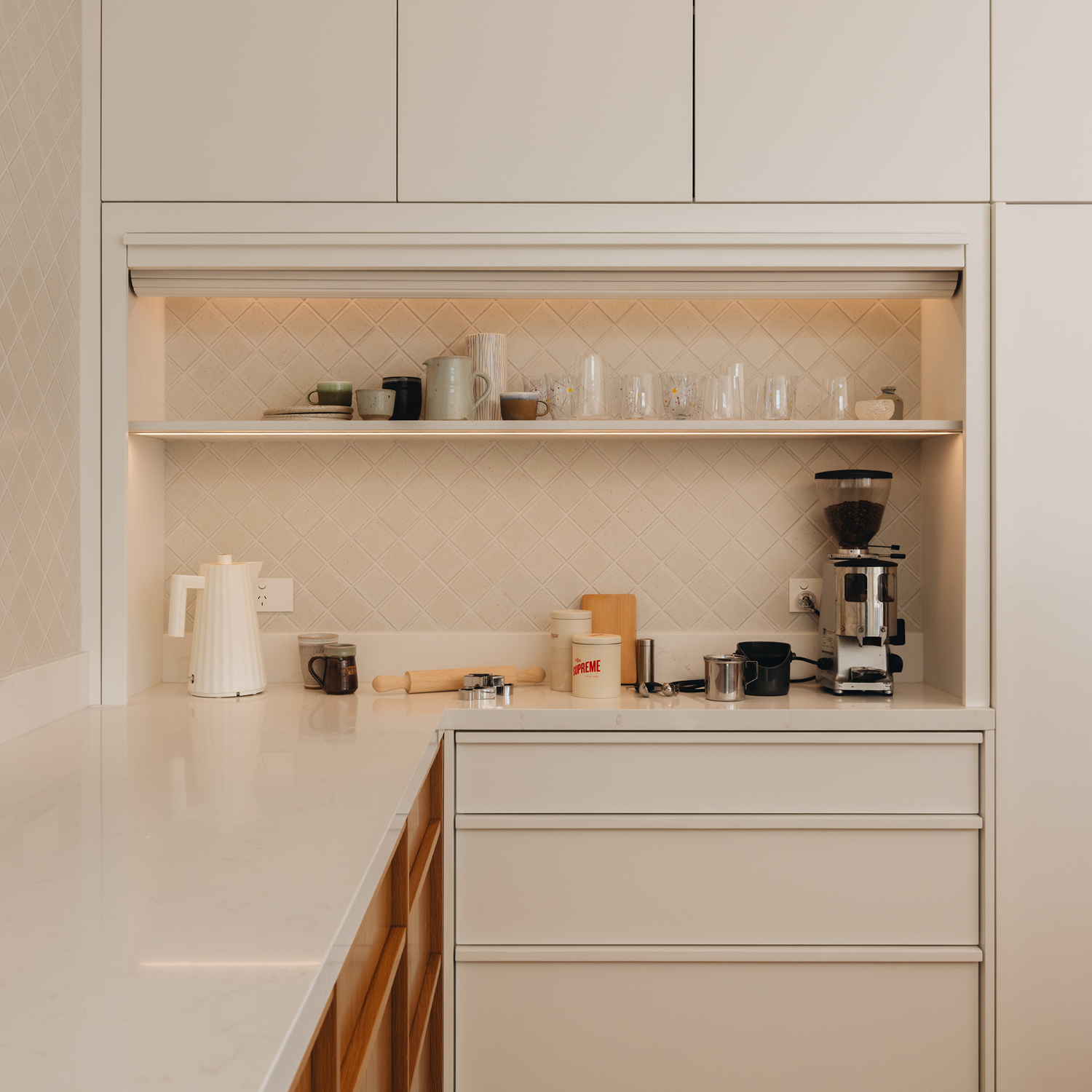
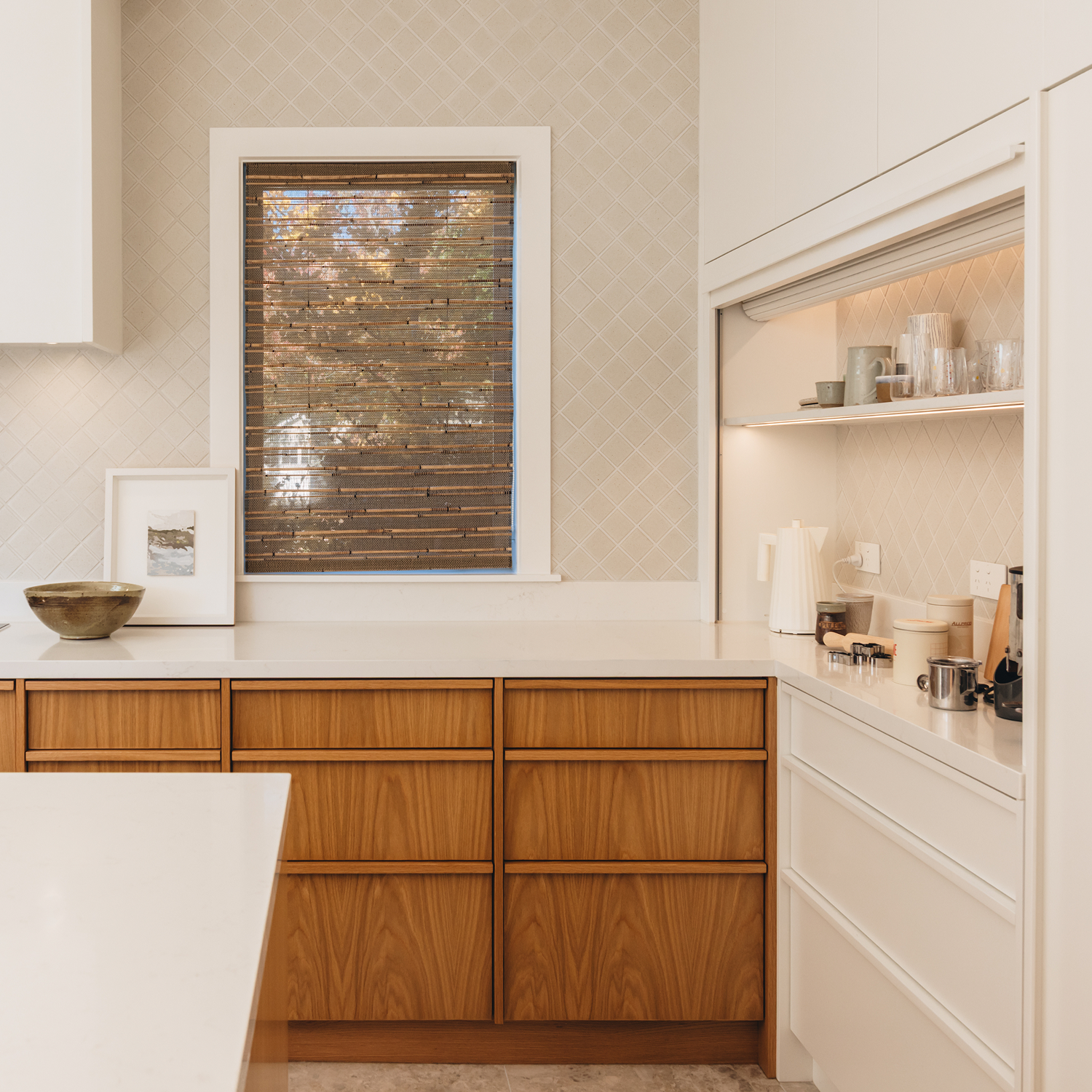
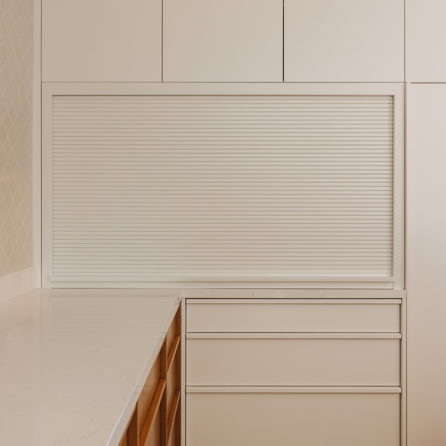
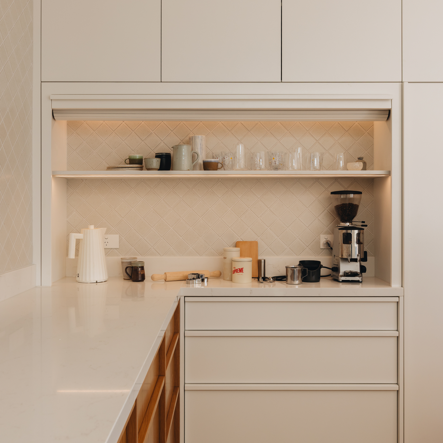
The room was around eight or ten steps from the kitchen, and from experience we know that even six steps starts to feel like a long way when you need the oil or flour halfway through cooking. Instead, we kept the storage where the cooking happens and ran cabinetry across the full width of the room, incorporating wide drawers, full-height cupboards and an appliance nook that closes neatly behind a roller door.
Tip: Count the steps between your main kitchen work surface and the things you use every day. Storage is most useful when it sits naturally within the way you move through the space.
4. A plain white tile, turned on its side
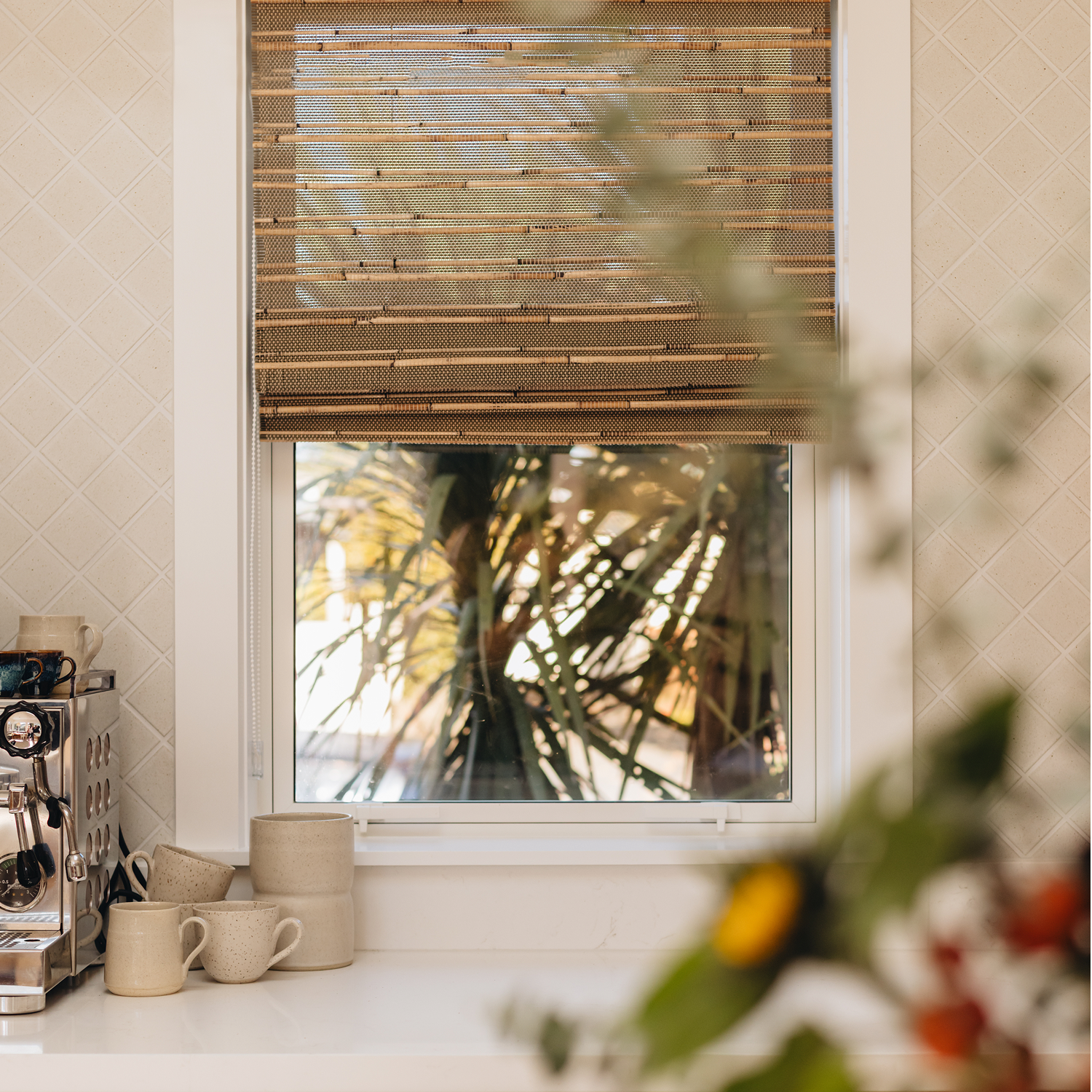
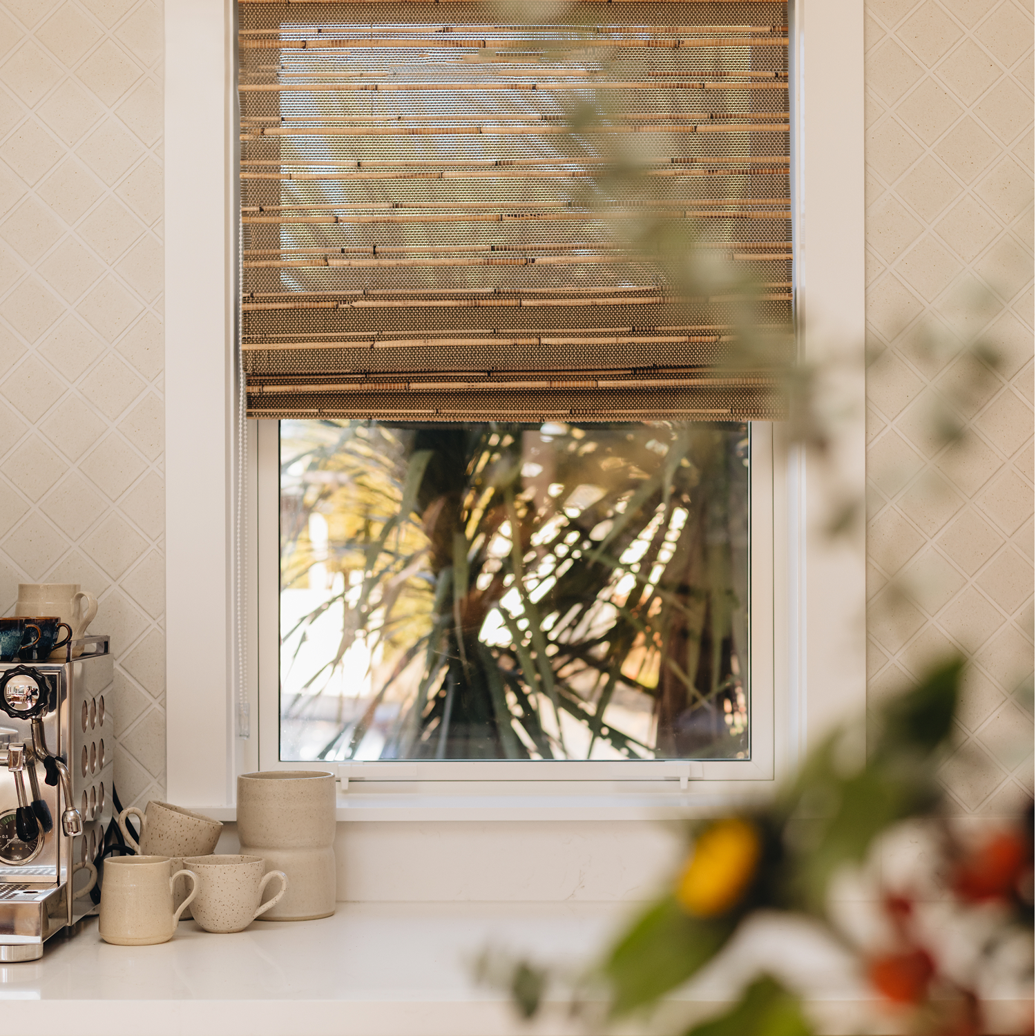
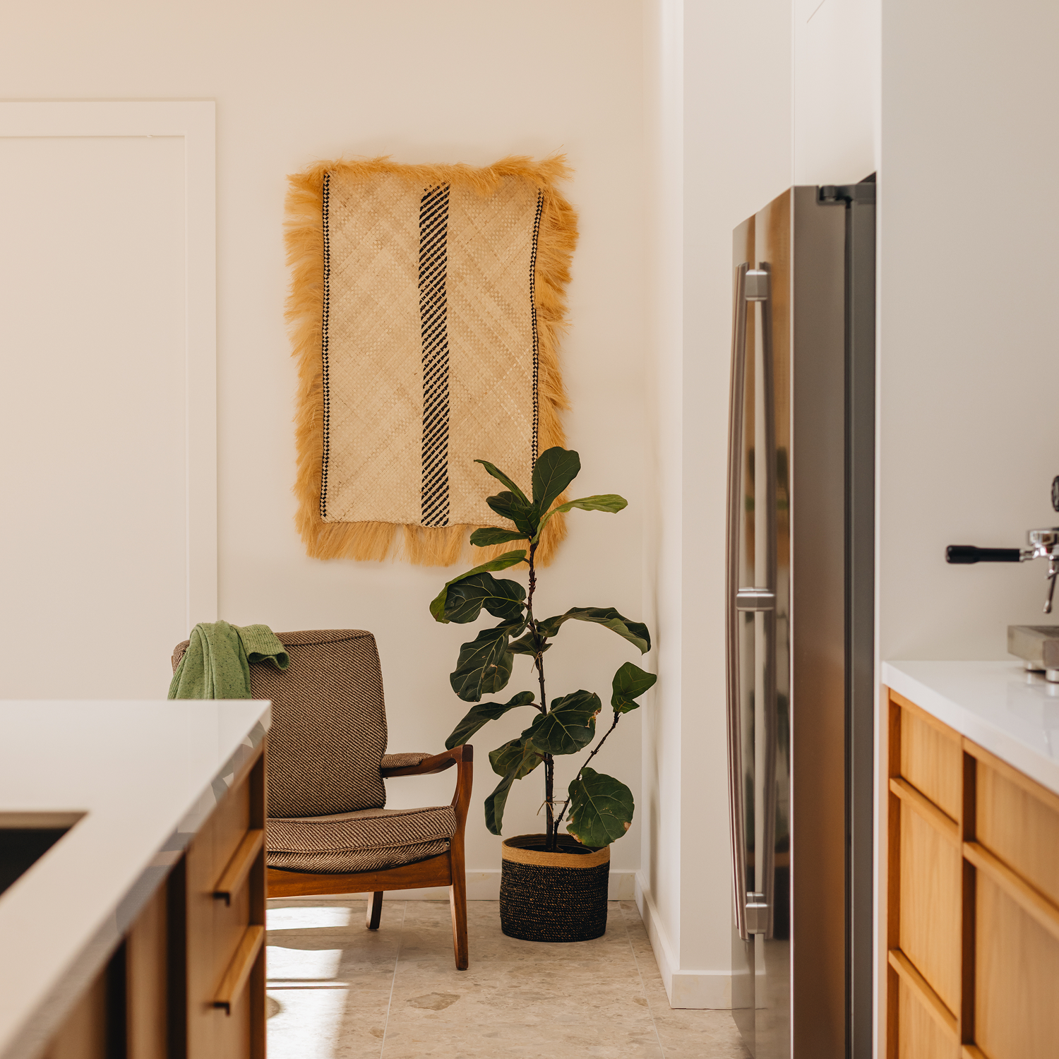
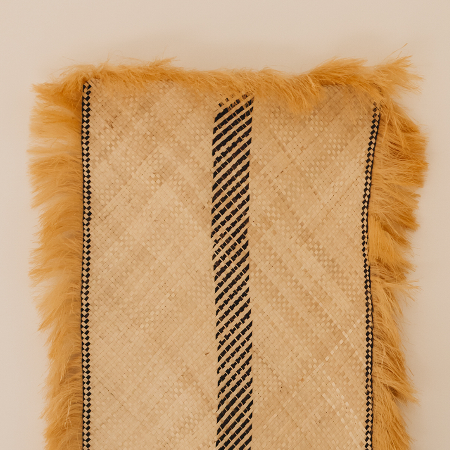
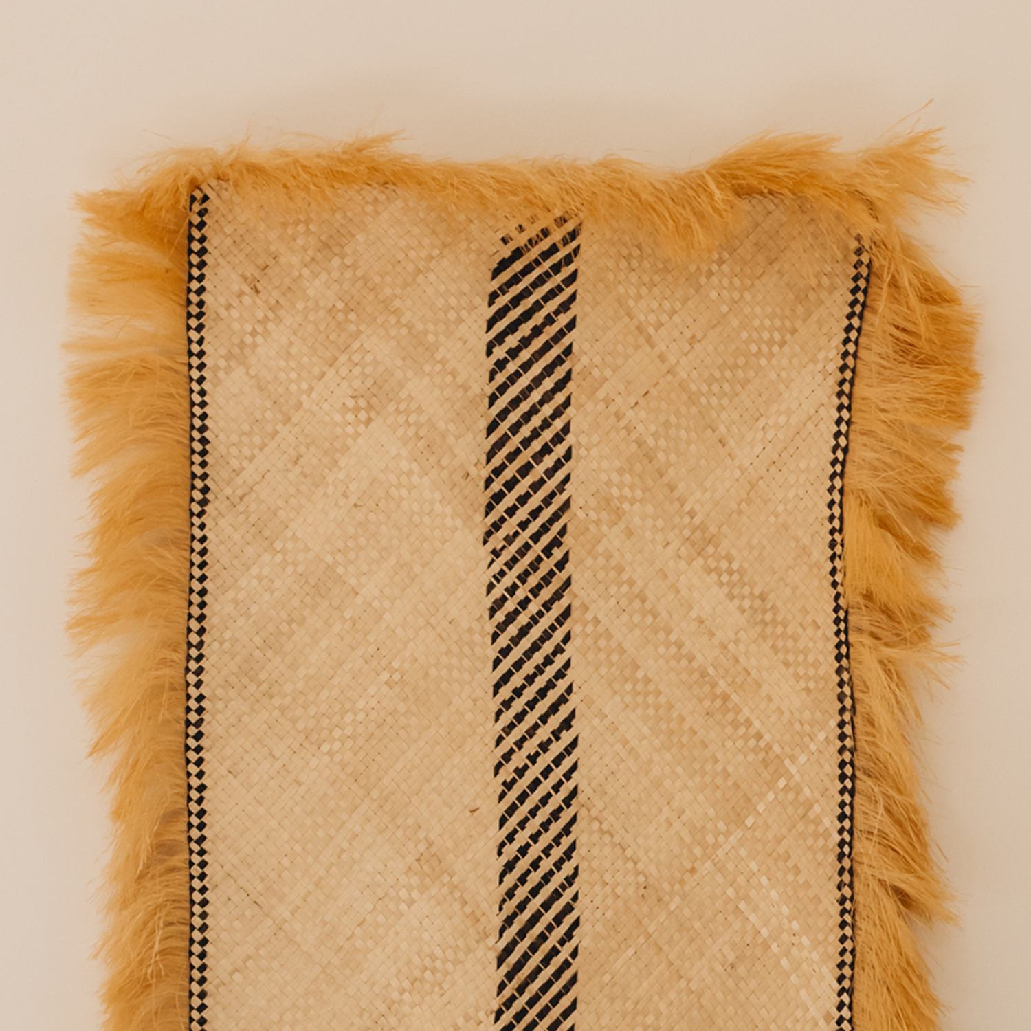
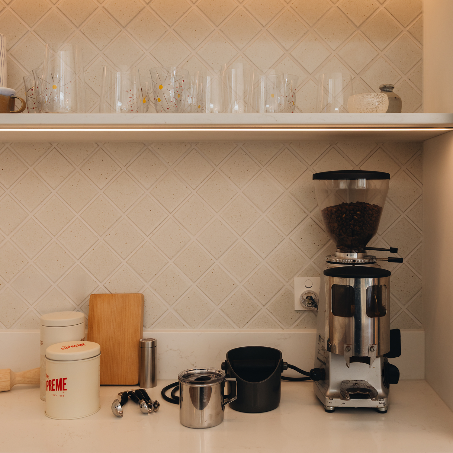
For us, the aesthetic direction for this kitchen began with a beautiful Fijian mat Kate had been gifted, with its fine, criss-crossing diagonal lines. That detail eventually found its way into the splashback.
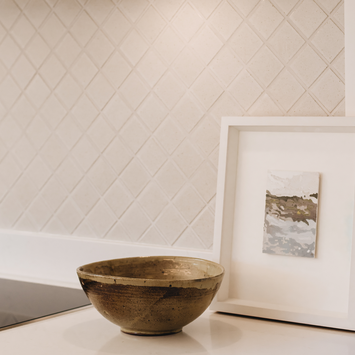
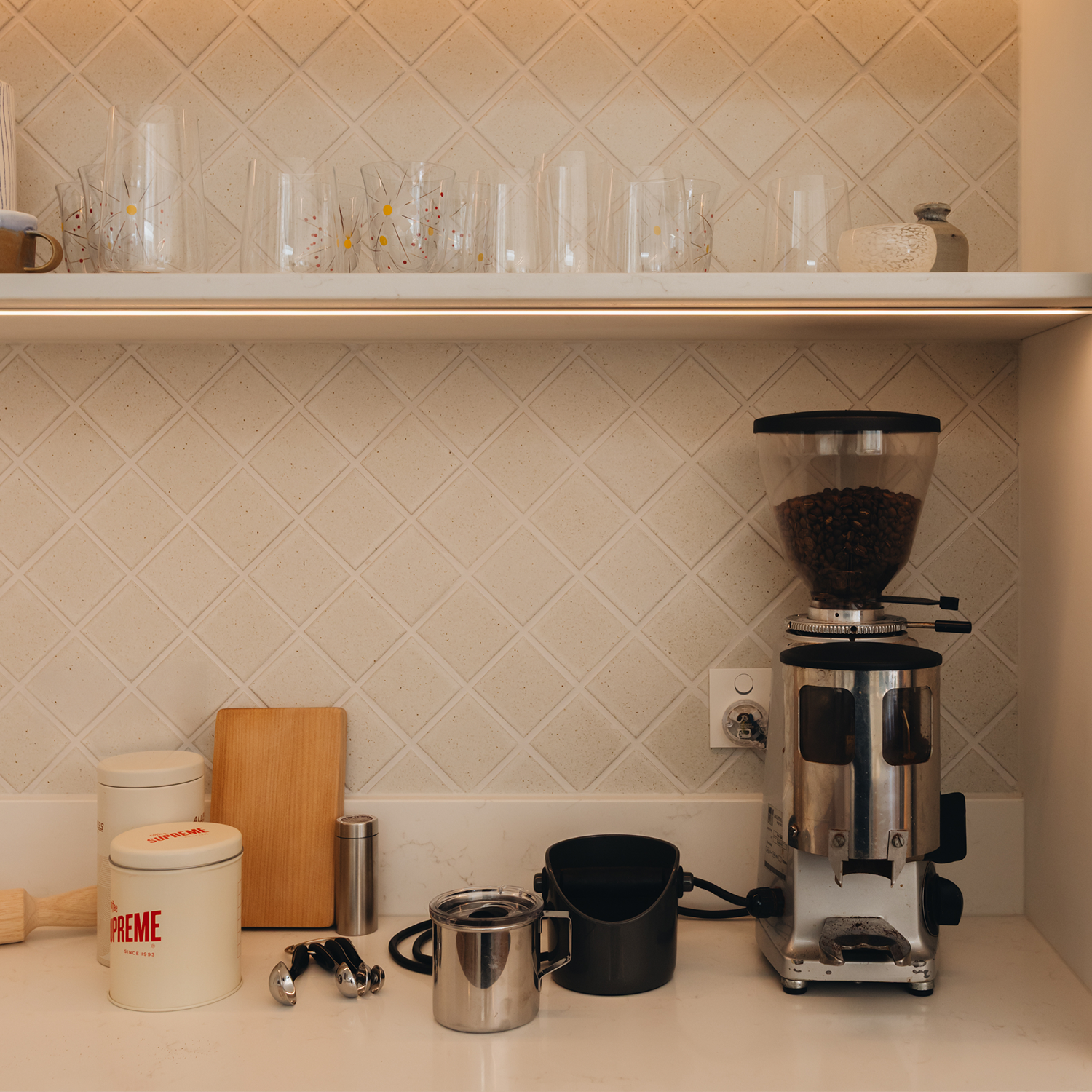
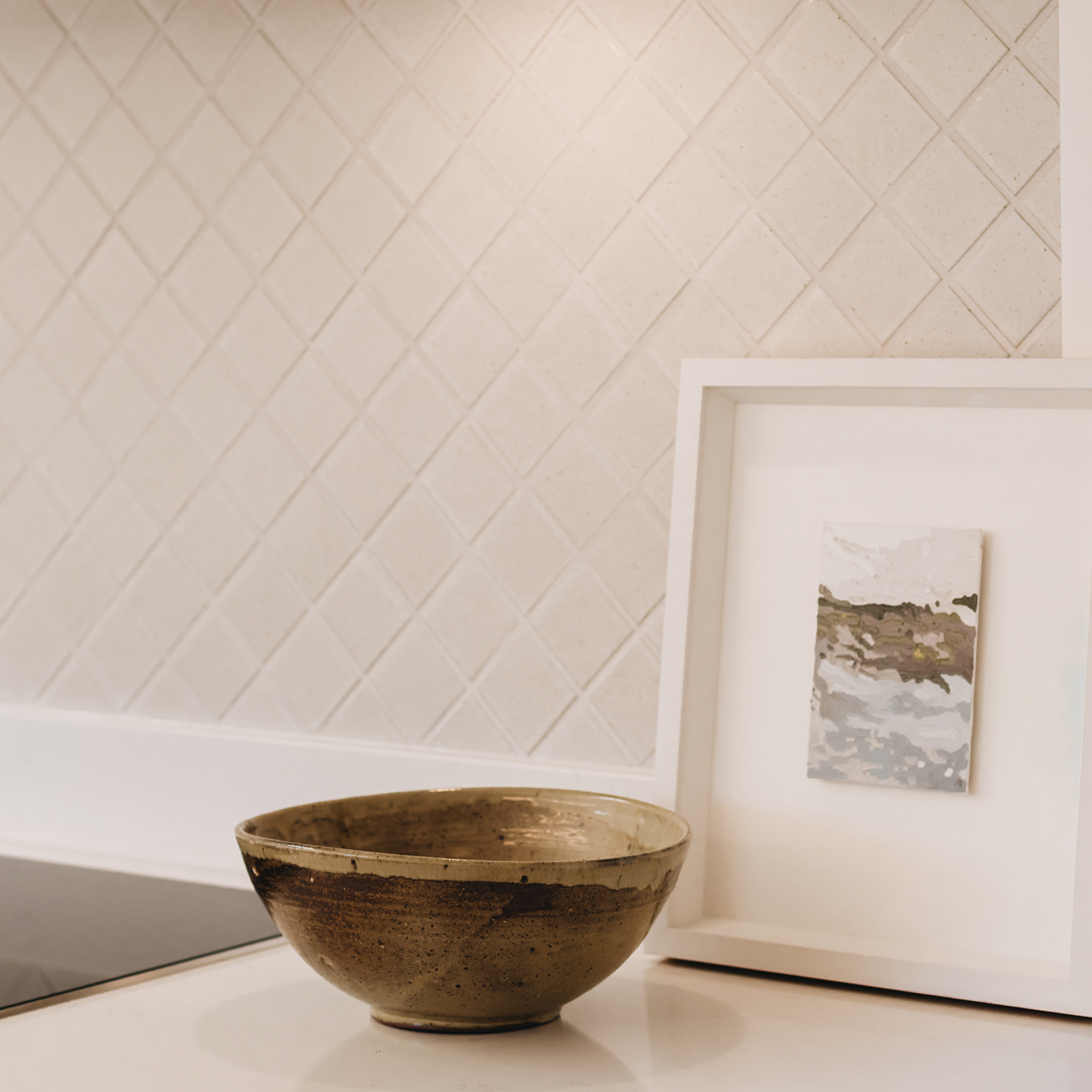
The tile itself is a simple white square. Laid traditionally, it would have been quiet and familiar. Turned on the diagonal, it brings movement and artfulness to a room otherwise defined by clean, straight lines.
It is the kind of decision that looks obvious once it is finished, but it needed an idea behind it. Inspiration is useful precisely when it forces you to do something differently.
Tip: One object, artwork or material you genuinely love can give you a stronger design direction than a hundred loosely connected saved images.
5. We showed them two ways forward, not one
Kate and Adam brought only four or five reference images to the process, but they were remarkably consistent: clean and simple, but warm, honey-toned timber, a white benchtop, sophisticated without feeling showy.
At Honour Creative we start every project with a Design Vision, giving both us and our clients a clear reference point for the decisions that follow. From there, we developed two layout options. One was the best version of what Kate and Adam had originally imagined. The other pushed the planning further and proposed something they had not considered, flipping the kitchen and dining zones and keeping the kitchen entirely within the main space. They chose the second.
A considered process is at the heart of every Honour Creative project. A good brief tells us what a client needs, it does not necessarily tell us the only way to get there. Our role is to listen carefully, then explore what else might be possible.
Tip: Never judge a layout on its own. Put the plan you have in your head next to one that deliberately breaks an assumption you have not questioned, then get someone with fresh eyes on both.
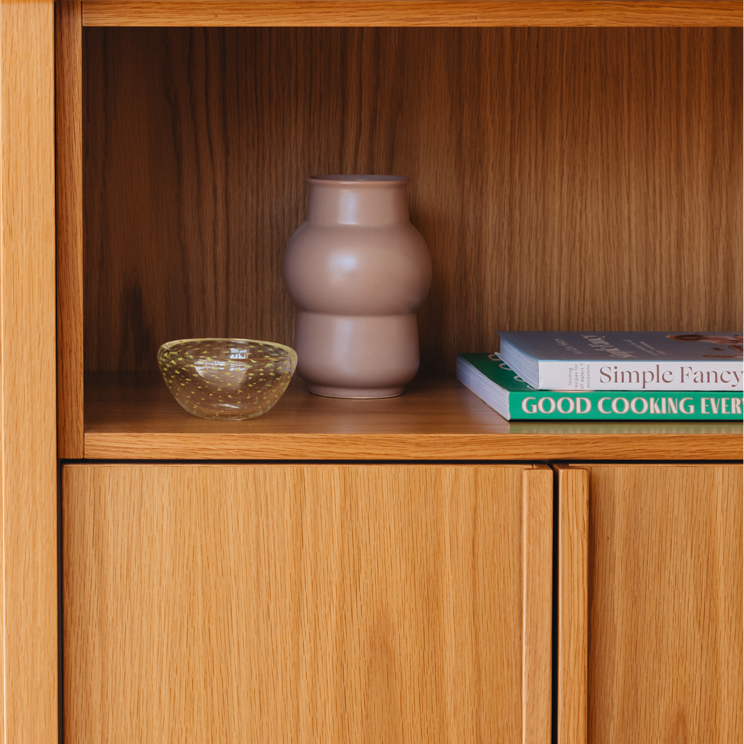
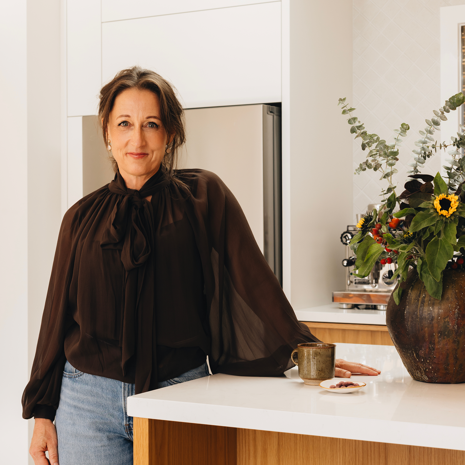
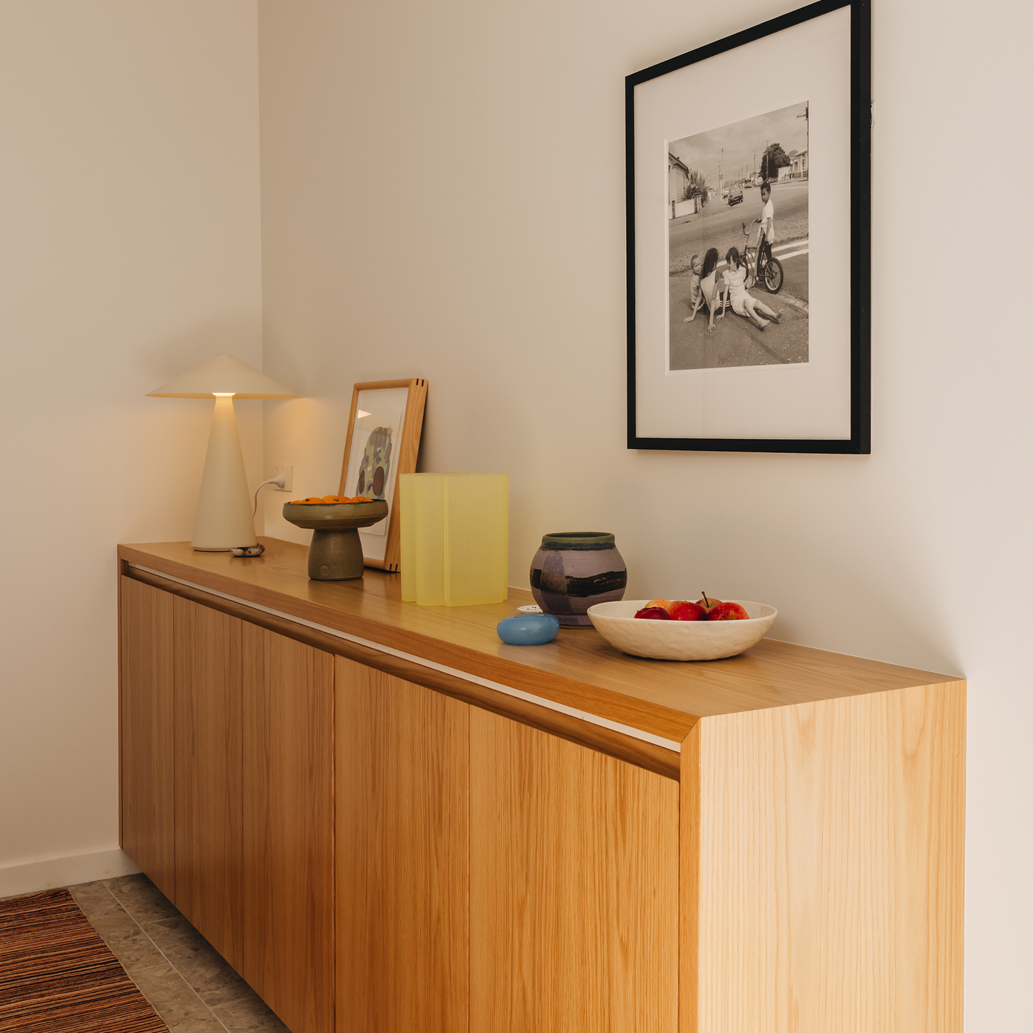
None of these decisions were dramatic on their own, but together they gave the family a kitchen they actually want to be in. Our favourite proof arrived after some informal photos were done, in a snap Kate sent through: their daughter tucked into the corner booth in the dining space after school, feet up, reading. For us, that is what a kitchen that belongs looks like.
You can see the finished kitchen in full on our Woburn Family Kitchen project page. If you are thinking about a kitchen renovation in Lower Hutt, Wellington or further afield, we would love to hear your dreams and plans, and how you imagine living in the space.